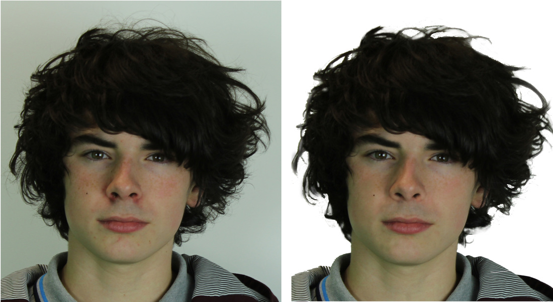
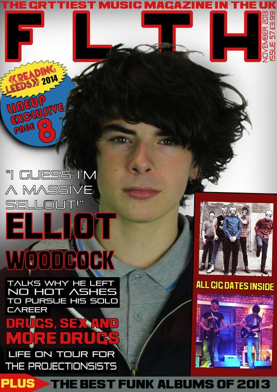
When I was developing my front cover I noticed Elliott's face had a lot of things that could do with changing, so like a real magazine I went ahead and used Photoshop to remove some of the blemishes and clear up his face a bit.
My main concern was the redness around his nose and while I changed that I decided to clear up all his face. The scar on his chin has been removed, his freckles are more faded and his eyebrows look more defined.
Sadly during editing at the time I didn't know how to change the background between his hair so I went ahead and did the best I could. Through the entire coursework process I have learned better how to edit the wall behind his hair (which can be seen on the Double Page Spread).
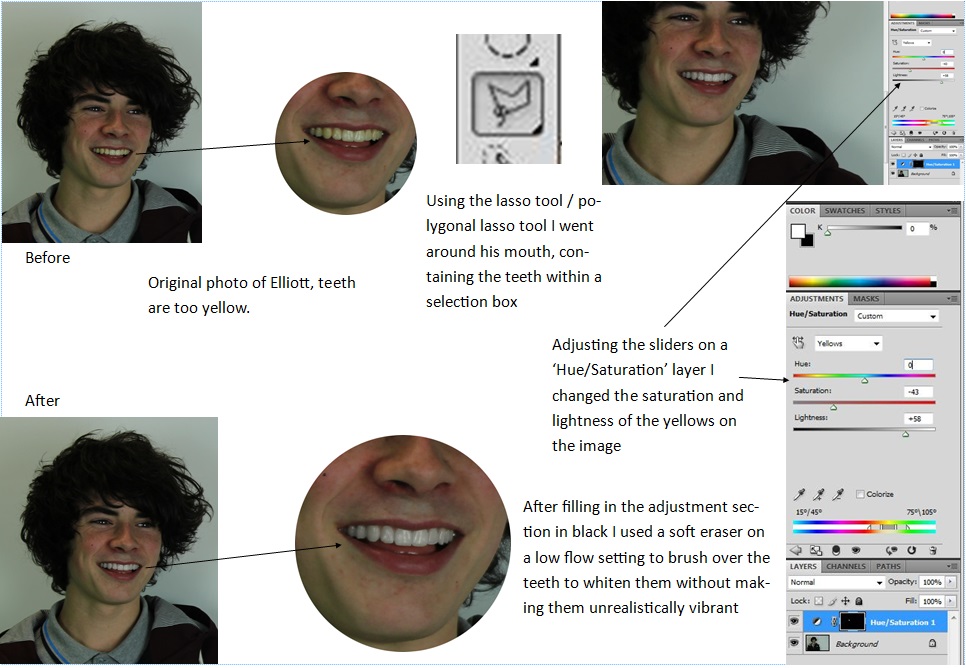
While producing my Double Page Spread I noticed Elliott's teeth were rather yellow, so I did what a real magazine would do and whitened them as to not look as unappealing. This is just my process of how I went about doing that.
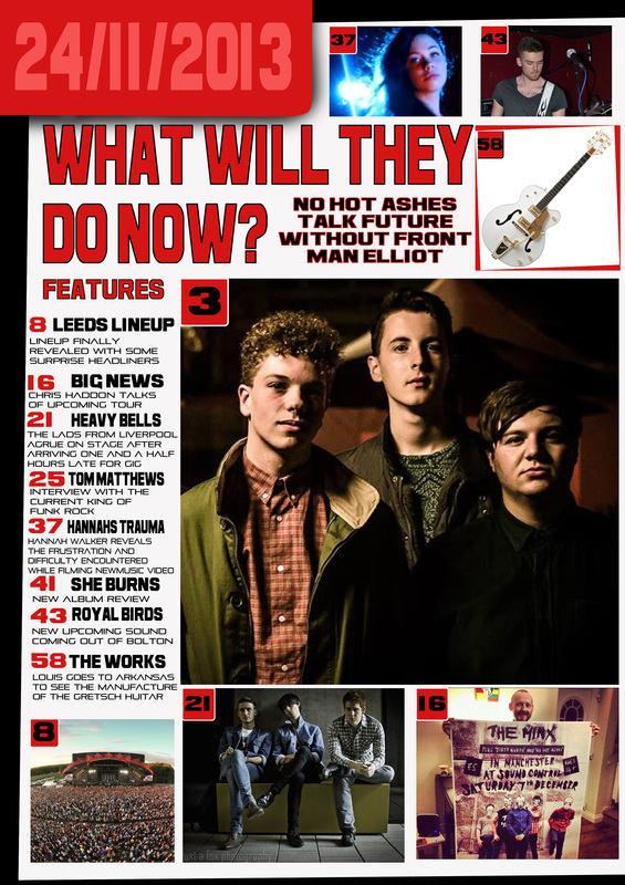
My final version of my contents page. Not much has been changed except I added 'Contents' to the top left to go along with the date as well.
My first draft of my contents page, taking conventions and inspiration of other magazine contents pages I have developed this design. Mostly this version is mostly complete however I've received some criticism of the date in the top left being the weakest part of the page.
On this final version of my music magazine I have cleaned up the shadows after some feedback let me know I should change it. The shadows around Elliot are now not as dark and under the pug I have made it much darker to make it stand out even more. I also enhanced the colour of his face as before he looked rather grey and unsaturated. Next I changed the text of the subheadings, swapping the names of 'No Hot Ashes' and 'The Projectionists' because the contents page and DPS wouldn't make sense. Because of this reason also I changed one of the secondary images to not feature No Hot Ashes.
The first draft of my music magazine is where I have experimented with the layouts of images and text. I used pink text to remind me where I needed to edit when it came to further development, doing this let me experiment with different fonts and colours before I stuck with one. I used the picture of the burger to help me determine how images would look at different places on the page.
On the second draft I had mostly done with the typography; settled on a colour and the placement and moved it away from his face. The layout of text and images are relatively finished and the addition of shadows in the background are used to try make the cover look more like he's in a spotlight. I also added a banner at the bottom which looks good as it finishes off the bottom of the page rather than leaving the image run to the end.
My music magazine will be based on the Indie Rock genre of music, it's widely popular and has a more creative artistic edge to it than a Pop magazine might have. The style of my magazine will be similar to NME, Rolling Stone and Q magazine as they are known worldwide for being creative and professional.
My target audience will be fans of the genre, ranging from ages between 14-30, but will also be aimed at people who are interested in new up and coming bands as that will be a secondary focus of the magazine. The magazine will inform the reader of the current state of Indie Rock, what's happening and will involve exclusives with the artists my target audience are interested in. There will also be information on gig dates and festival line-ups to reach as wide an audience as possible.
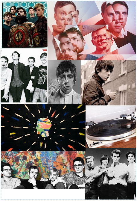
My mood board consists of images related to the genre of music I want my music magazine to represent. They show the style of indie rock, mostly having an older, vintage look about them with the clothing and hairstyles.
Main task: the front page, contents and double page spread of a new music magazine (if done as a group task, each member of the group to produce an individual edition of the magazine, following the same house style).
Maximum four members to a group. All images and text used must be original, produced by the candidate(s), minimum of four images per candidate
I drew some quick sketches of the general layout of my magazine cover and how I want the photo laid out and what I want in the image. I'll use these as a guide when it comes to my final designs.
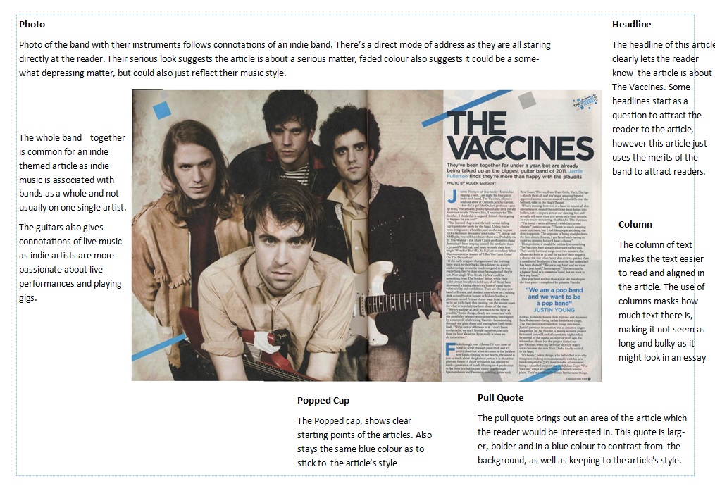
We did an in depth analysis on a double page spread of our choice, picking out each convention and going through them in detail. I've looked at the photo and its connotations, the way the headline and columns have been laid out, the use of a pull quote and a popped cap to enhance the text. Doing this will help me when it comes to laying out my Double Page Spread.
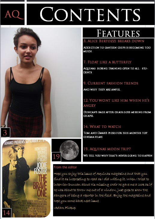
For the preliminary task we also needed to design an Aquinas magazine contents page that would be consistent with the house style and looked professional. After analysing the contents pages of different magazines I followed the conventions they have and tried to implement them into my contents page. I have used a large main image as well as secondary images, a neat column which clearly displays the contents and also a note from the editor. This could be improved on however, the note from the editor was used to fill empty space, that could be filled with other features instead or more photos to look more professional.
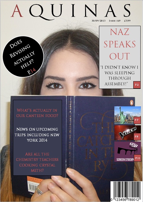
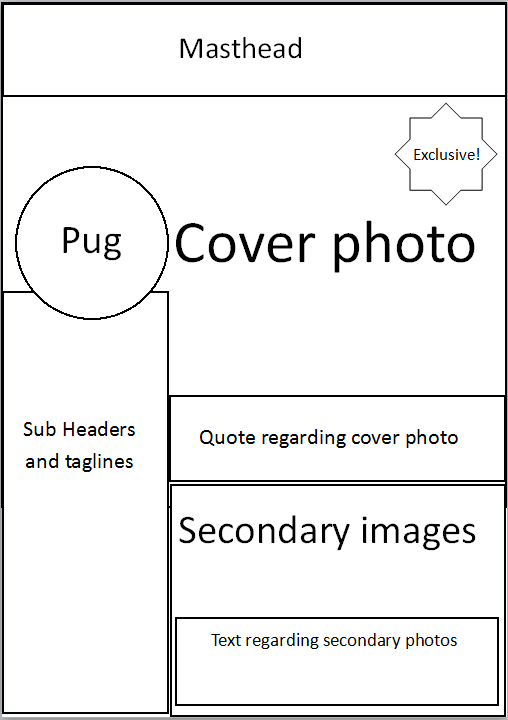
For the preliminary task we designed a cover for an Aquinas magazine which incorporate many of the conventions on magazine covers. From analysing different magazine covers I have found what looks professional and the conventions which are regularly featured on magazine covers such as the masthead, a pug, sub headers and others. I kept to one font for all the text as it keeps it looking professional and consistent, similarly I tried to keep the colour scheme consistent too keeping the same red frequent and alternating with black and white.
The layout looks typical to a magazine cover with the masthead being large at the top of the page, the typography being well proportioned and consistent and secondary images to show what else is in the magazine. This could still be improved however, there's a lot of empty space, the secondary images are quite small and the pull quote goes over the subjects face.
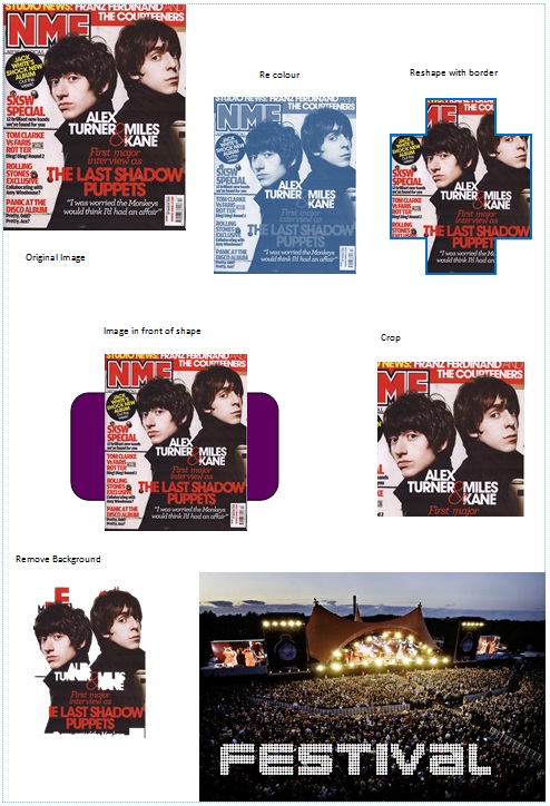
We carried out a series of tasks to practice basic photo manipulation with tools provided on publisher such as cropping, re colouring and removing the background. Manipulating images in different ways can change the connotations they hold. Colour is a basic one, colouring it red can connotate anger, or changing the brightness can change the mood of the image. I have shown here that have the capabilities to edit photos in different ways which will be useful when it comes to manipulating images for my cover, contents and double page spread.
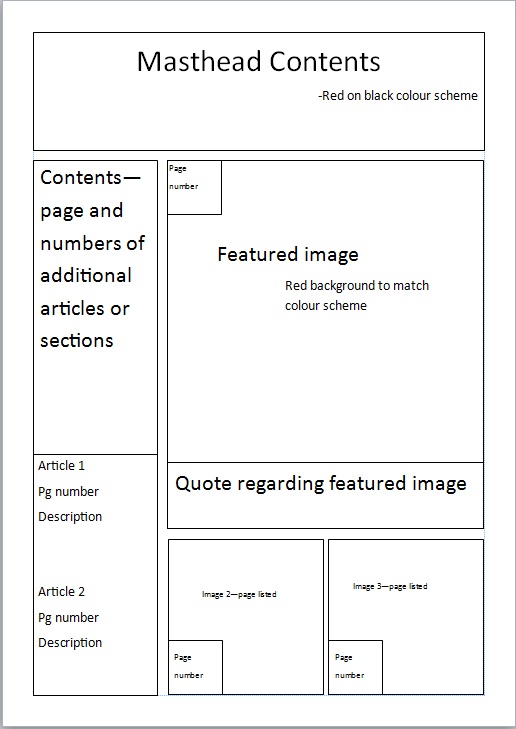
Similarly to the cover page we have mocked up a flat plan for the contents page. After analysing different contents pages I have come up with this draft which has many of the features of real magazines. This is my draft copy and will be developed on when I come to developing my contents page.
This flat plan for the cover page of the magazine is a quick draft of how the cover could be laid out. This is a basic design of the layout and will be developed on in the future.
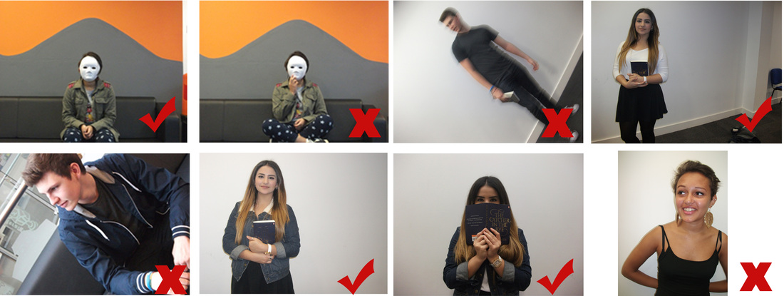
Out of the photos we have taken so far we have selected a few which could be used as a cover photo and some which can't. The ones I have selected are clear images with good lighting. The ones I have deselected however can't be used as they are either blurry, at a canted angle and on one picture the subjects hand covers the mask.
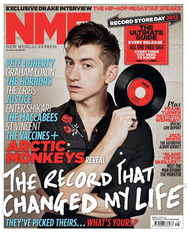
NME is a music magazine without a definitive genre, sometimes including pop and hip-hop, but is mostly associated with Indie Rock. Each issue features different cover stars or groups to reach a wider audience, but in this case it features Alex Turner, an icon for Indie Rock culture.
The first thing we notice on a cover is the cover star, usually drawing us to their eyes with 'the gaze', he is looking straight at us and it draws us in. Then we can notice his style, the slicked back hair is common with the Indie Rock genre and is usually associated with the past. Alex is also holding up a vinyl record, an outdated way of listening to music and is incredibly uncommon, but are collected and used by listeners of the indie genre.
NME has a regular house style, sticking to fonts and colour schemes helping make the magazine noticeable. The usual colour scheme is red and black is easily noticeable and makes the text easy on the readers eyes, and the straight lines and clear type reinforce this. These hold connotations of it being a dark and quite personal magazine while being clear and to the point with their articles.
The header is consistent with the magazine, and is neat and easily noticeable due to its font and popularity. In this case the header goes behind the cover star; the brand is popular and well known enough that the full header is not needed to be revealed for people to know which magazine it is. The subheadings are also using a font which is consistent with previous magazines keeping to the house style the brand has set itself.
The anchor text contrasts from the rest of the cover however, being white and in a completely non uniform font. The typography makes it feel more common to Alex Turner and as if he wrote it.
The magazine also features the names of other artists who are featured within the magazine and are all in a contrasting colour to the usual red and black making the names stand out on the cover. There's also the use of a pull quote saying "blame me for Skrillex!" which raises questions and mystery about the contents of the magazine.
Overall I feel the most important elements of a magazine cover are the cover star, masthead and the colour scheme. The cover star is the first thing which is noticed so it needs to be inviting as well as looking interesting. The masthead and colour scheme need to stand out and offer an instant idea of what genre the magazine is representing while also being clear to read.
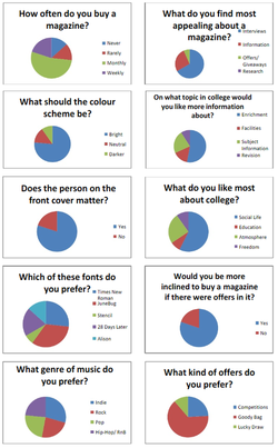
We conducted a survey to figure out people's preferences about music magazines, with questions such as the best colour scheme, fonts, the topics involved in the magazine and what offers they would like to see in it.
Using this information I will be able to more appropriately design a magazine which will appeal to the most people it can.
A range of magazine covers to show their layouts and conventions; what reccurs throughout each cover

 RSS Feed