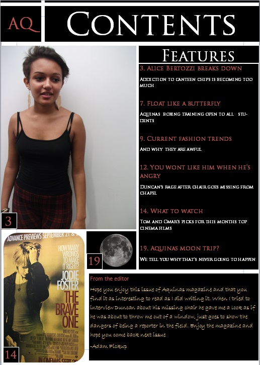
For the preliminary task we also needed to design an Aquinas magazine contents page that would be consistent with the house style and looked professional. After analysing the contents pages of different magazines I followed the conventions they have and tried to implement them into my contents page. I have used a large main image as well as secondary images, a neat column which clearly displays the contents and also a note from the editor. This could be improved on however, the note from the editor was used to fill empty space, that could be filled with other features instead or more photos to look more professional.
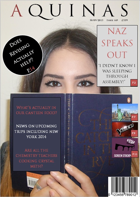
For the preliminary task we designed a cover for an Aquinas magazine which incorporate many of the conventions on magazine covers. From analysing different magazine covers I have found what looks professional and the conventions which are regularly featured on magazine covers such as the masthead, a pug, sub headers and others. I kept to one font for all the text as it keeps it looking professional and consistent, similarly I tried to keep the colour scheme consistent too keeping the same red frequent and alternating with black and white.
The layout looks typical to a magazine cover with the masthead being large at the top of the page, the typography being well proportioned and consistent and secondary images to show what else is in the magazine. This could still be improved however, there's a lot of empty space, the secondary images are quite small and the pull quote goes over the subjects face.
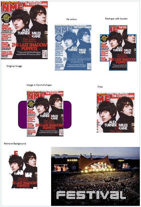
We carried out a series of tasks to practice basic photo manipulation with tools provided on publisher such as cropping, re colouring and removing the background. Manipulating images in different ways can change the connotations they hold. Colour is a basic one, colouring it red can connotate anger, or changing the brightness can change the mood of the image. I have shown here that have the capabilities to edit photos in different ways which will be useful when it comes to manipulating images for my cover, contents and double page spread.
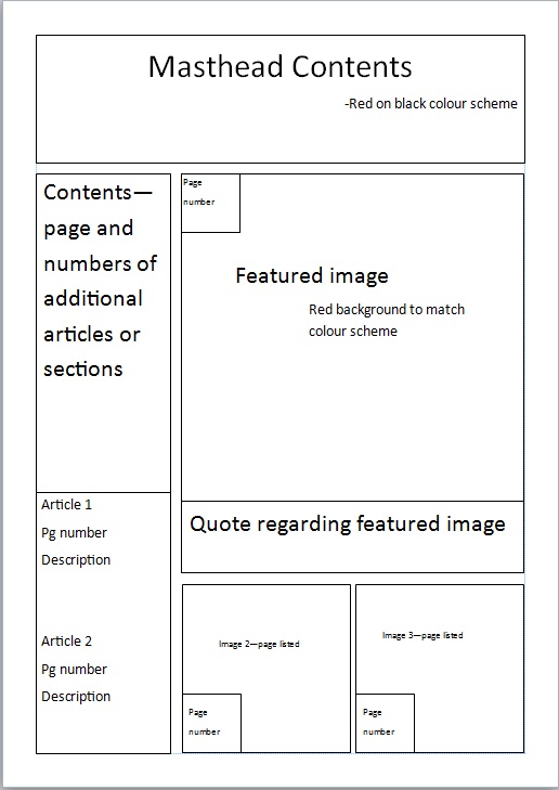
Similarly to the cover page we have mocked up a flat plan for the contents page. After analysing different contents pages I have come up with this draft which has many of the features of real magazines. This is my draft copy and will be developed on when I come to developing my contents page.
 RSS Feed