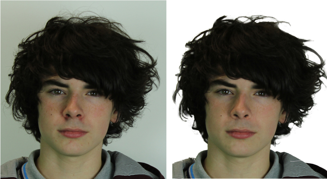
When I was developing my front cover I noticed Elliott's face had a lot of things that could do with changing, so like a real magazine I went ahead and used Photoshop to remove some of the blemishes and clear up his face a bit.
My main concern was the redness around his nose and while I changed that I decided to clear up all his face. The scar on his chin has been removed, his freckles are more faded and his eyebrows look more defined.
Sadly during editing at the time I didn't know how to change the background between his hair so I went ahead and did the best I could. Through the entire coursework process I have learned better how to edit the wall behind his hair (which can be seen on the Double Page Spread).
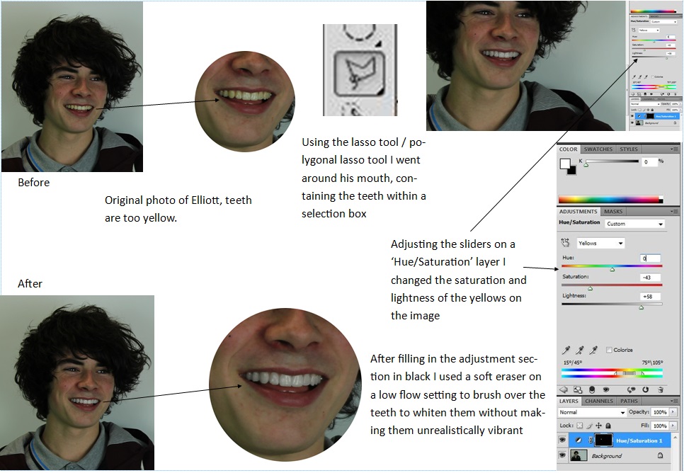
While producing my Double Page Spread I noticed Elliott's teeth were rather yellow, so I did what a real magazine would do and whitened them as to not look as unappealing. This is just my process of how I went about doing that.
My final version of my contents page. Not much has been changed except I added 'Contents' to the top left to go along with the date as well.
My first draft of my contents page, taking conventions and inspiration of other magazine contents pages I have developed this design. Mostly this version is mostly complete however I've received some criticism of the date in the top left being the weakest part of the page.
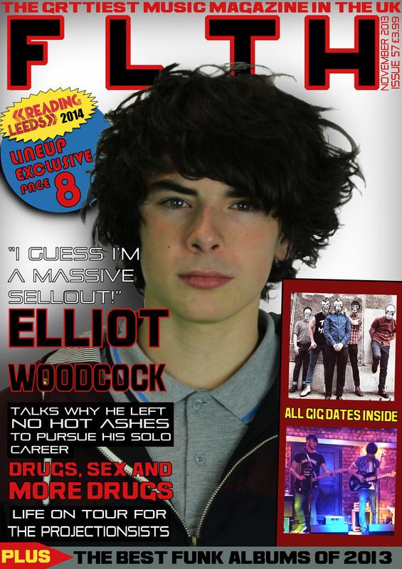
On this final version of my music magazine I have cleaned up the shadows after some feedback let me know I should change it. The shadows around Elliot are now not as dark and under the pug I have made it much darker to make it stand out even more. I also enhanced the colour of his face as before he looked rather grey and unsaturated. Next I changed the text of the subheadings, swapping the names of 'No Hot Ashes' and 'The Projectionists' because the contents page and DPS wouldn't make sense. Because of this reason also I changed one of the secondary images to not feature No Hot Ashes.
The first draft of my music magazine is where I have experimented with the layouts of images and text. I used pink text to remind me where I needed to edit when it came to further development, doing this let me experiment with different fonts and colours before I stuck with one. I used the picture of the burger to help me determine how images would look at different places on the page.
On the second draft I had mostly done with the typography; settled on a colour and the placement and moved it away from his face. The layout of text and images are relatively finished and the addition of shadows in the background are used to try make the cover look more like he's in a spotlight. I also added a banner at the bottom which looks good as it finishes off the bottom of the page rather than leaving the image run to the end.
My music magazine will be based on the Indie Rock genre of music, it's widely popular and has a more creative artistic edge to it than a Pop magazine might have. The style of my magazine will be similar to NME, Rolling Stone and Q magazine as they are known worldwide for being creative and professional.
My target audience will be fans of the genre, ranging from ages between 14-30, but will also be aimed at people who are interested in new up and coming bands as that will be a secondary focus of the magazine. The magazine will inform the reader of the current state of Indie Rock, what's happening and will involve exclusives with the artists my target audience are interested in. There will also be information on gig dates and festival line-ups to reach as wide an audience as possible.

 RSS Feed