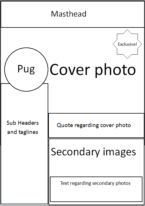
This flat plan for the cover page of the magazine is a quick draft of how the cover could be laid out. This is a basic design of the layout and will be developed on in the future.
|
|
|
| This flat plan for the cover page of the magazine is a quick draft of how the cover could be laid out. This is a basic design of the layout and will be developed on in the future.
0 Comments
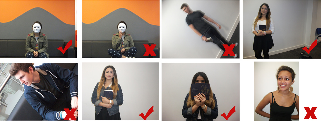 Out of the photos we have taken so far we have selected a few which could be used as a cover photo and some which can't. The ones I have selected are clear images with good lighting. The ones I have deselected however can't be used as they are either blurry, at a canted angle and on one picture the subjects hand covers the mask.
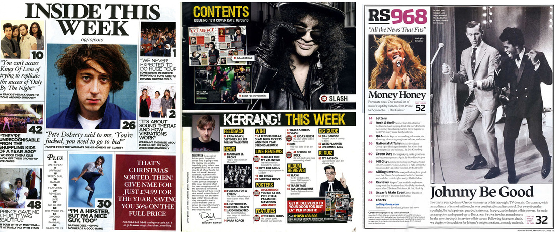 We analysed three contents pages from different magazines to look at the similarities and differences they each have, doing this will help give us an idea as to what we should include when developing our own magazines.
Similarities:
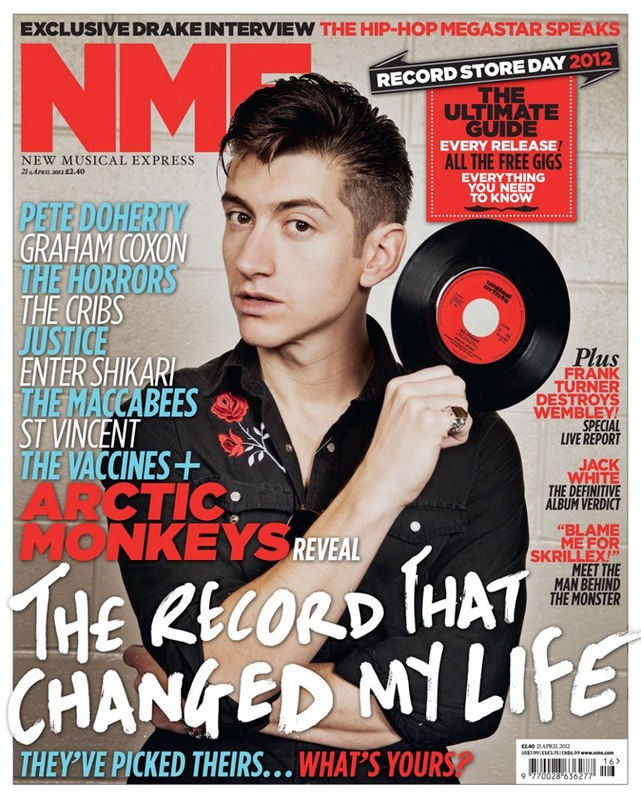 NME is a music magazine without a definitive genre, sometimes including pop and hip-hop, but is mostly associated with Indie Rock. Each issue features different cover stars or groups to reach a wider audience, but in this case it features Alex Turner, an icon for Indie Rock culture.
The first thing we notice on a cover is the cover star, usually drawing us to their eyes with 'the gaze', he is looking straight at us and it draws us in. Then we can notice his style, the slicked back hair is common with the Indie Rock genre and is usually associated with the past. Alex is also holding up a vinyl record, an outdated way of listening to music and is incredibly uncommon, but are collected and used by listeners of the indie genre. NME has a regular house style, sticking to fonts and colour schemes helping make the magazine noticeable. The usual colour scheme is red and black is easily noticeable and makes the text easy on the readers eyes, and the straight lines and clear type reinforce this. These hold connotations of it being a dark and quite personal magazine while being clear and to the point with their articles. The header is consistent with the magazine, and is neat and easily noticeable due to its font and popularity. In this case the header goes behind the cover star; the brand is popular and well known enough that the full header is not needed to be revealed for people to know which magazine it is. The subheadings are also using a font which is consistent with previous magazines keeping to the house style the brand has set itself. The anchor text contrasts from the rest of the cover however, being white and in a completely non uniform font. The typography makes it feel more common to Alex Turner and as if he wrote it. The magazine also features the names of other artists who are featured within the magazine and are all in a contrasting colour to the usual red and black making the names stand out on the cover. There's also the use of a pull quote saying "blame me for Skrillex!" which raises questions and mystery about the contents of the magazine. Overall I feel the most important elements of a magazine cover are the cover star, masthead and the colour scheme. The cover star is the first thing which is noticed so it needs to be inviting as well as looking interesting. The masthead and colour scheme need to stand out and offer an instant idea of what genre the magazine is representing while also being clear to read. 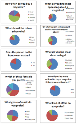 We conducted a survey to figure out people's preferences about music magazines, with questions such as the best colour scheme, fonts, the topics involved in the magazine and what offers they would like to see in it. Using this information I will be able to more appropriately design a magazine which will appeal to the most people it can. A range of magazine covers to show their layouts and conventions; what reccurs throughout each cover | AuthorWrite something about yourself. No need to be fancy, just an overview. ArchivesDecember 2013 Categories |
 RSS Feed